MySpace has introduced a major user interface overhaul; because the user base of MySpace includes both traditional consumers as well as producers of original content (and, in either case, suppliers of demographic data for advertisers), this change affects different users in different ways.
With a single advertising campaign, MySpace is both announcing the change and, simultaneously, providing a mechanism to monitor user reactions to the change. The advertising has, in a sense, been cast to the swarm, crowdsourced to the micro-blogging service Twitter.
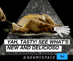
The text to the left of the blue Go button as it appears in the ad above does a number of different things. First, it informs users that the changes to MySpace are more than cosmetic; the service has traditionally been a popular resource for cash-strapped bands in search of a media-rich web presence, but these latest changes to MySpace are in many ways oriented more towards the convenience of the service’s current (or prospective) media consumers. Information about pop culture and celebrities are pushed on users aggressively.
Second, the formatting of the text refers to the syntax of Twitter messaging: the # at the beginning of the text signifies that the attached adverb and proper noun will together function as a keyword or a tag for a post made with Twitter. Anybody can visit twitter.com and easily see all the posts tagged with the advertised text, making it easy for the MySpace marketing staff to, essentially, eavesdrop on a massive user discussion about the changes. MySpace doesn’t even need to put together a focus group because the Twitter makes users enjoy (or at least see no adverse consequence to) organizing their own discussion on behalf of MySpace.
Third, the reference to Twitter in the MySpace ad satisfies a certain postmodern cultural preference for referentiality. The referential qualities of the text’s formatting say new, hip, participatory, democratic. It’s a sort of techno-fetishism for the cult of progress. In a way, the advertising campaign for the new MySpace is not so much about the changes to the service (which are self-evident to a large number of existing users), but is more about the Twitter tag. If new users learn about the new MySpace, it will in many cases likely be through some other social media service (since, in the past, MySpace was not sufficiently reputable for continuous news coverage, while today, FaceBook is as popular as Google).
The discussion on Twitter varies in character, but gravitates towards various themes:

It’s fair to assume from the @ in the above Tweet™ that MySpace is actively monitoring the Twitter discussion. The above Tweet™ is furthermore genuinely diplomatic, offering constructive suggestions.
Many express basic statements of preference:

Others suggest the usage of basic features — which was once self-evident — has either been moved, removed, or counter-intuitively re-organized:
Some Tweet™s describe or advocate specific actions among MySpace users:
Occasionally, a Tweet™ will combine the advertised tag with other tags, treating the tags almost like semantic primitives (or even a little like ideograms built from a combination of Western punctuation and latin characters (and in some cases, Arabic numerals)):
Here’s a sample of some consecutive Tweet™s:
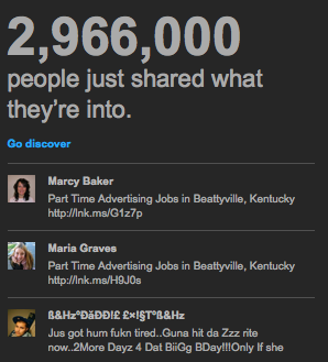
One new feature that caught my attention was the Discover button. Whenever your mouse rolls over the Discover button, the following appears on top of the new interface:
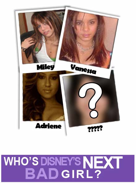
If you click the Next button in the lower right, the thumbnail images change:
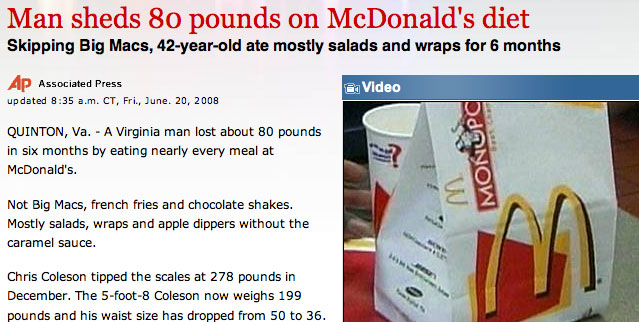
Clicking on the Next button a second time produces this:
Which means, if you choose to engage with the Discover button by clicking on Next once, and then choose to continue by giving it a second click, after that second click, the Next and the Prev button are functionally equivalent. Once you’ve expressed enough interest to commit to a second click, the purpose of this interface element is to provide an illusion of choice.
